My Role
Junior UI/UX Designer – responsible for understanding user needs, creating wireframes, and delivering UI aligned with brand guidelines under senior supervision.
Project Summary
The platform was built to manage radioactive waste from detection to safe storage. As a junior designer, I was part of a team responsible for redesigning the NORM platform to help safety teams monitor hazardous material containers, storage yards, and radiation levels across locations. The goal was to make complex radiological data easy to understand and act upon across web and mobile.
The Challenge / Problem
Users were overwhelmed by cluttered data and lacked a way to quickly assess radiological safety levels.
Navigation between container, yard, and analysis data was disconnected, slowing down response and compliance checks.
The system needed to support non-technical field operators and radiation specialists across different devices with minimal training.
How I Discovered the Problem:
By reviewing the legacy system and observing sample workflows shared by stakeholders, I noted inconsistent information hierarchy and a lack of visual cues.
Field team inputs and business documents highlighted pain points such as delays in identifying hazardous containers and confusing analysis reports.
Project Purpose:
To digitally transform their hazardous material tracking, reduce safety risks, and comply with government radiation regulations through better UX and visualization.
The Solution
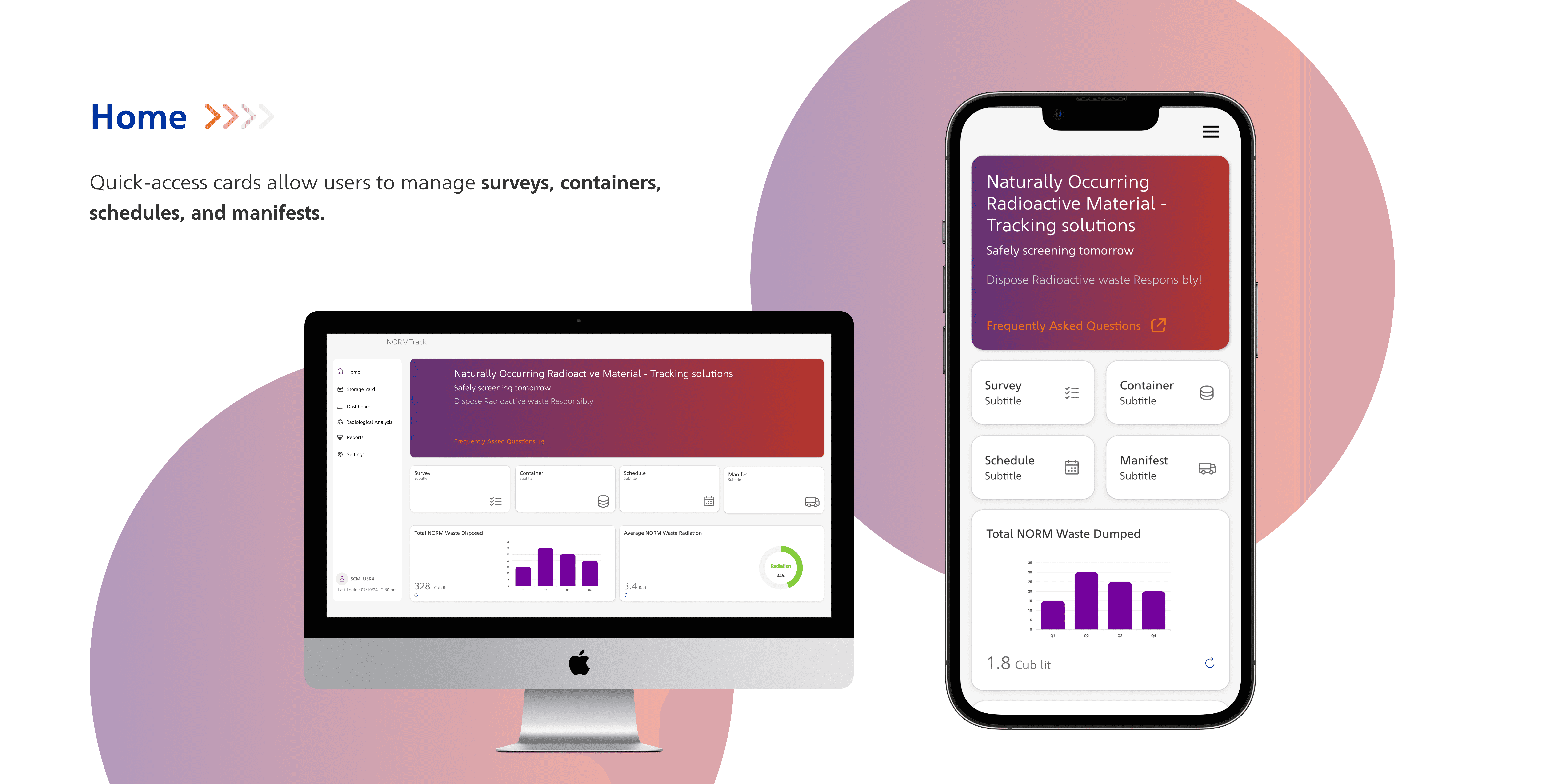
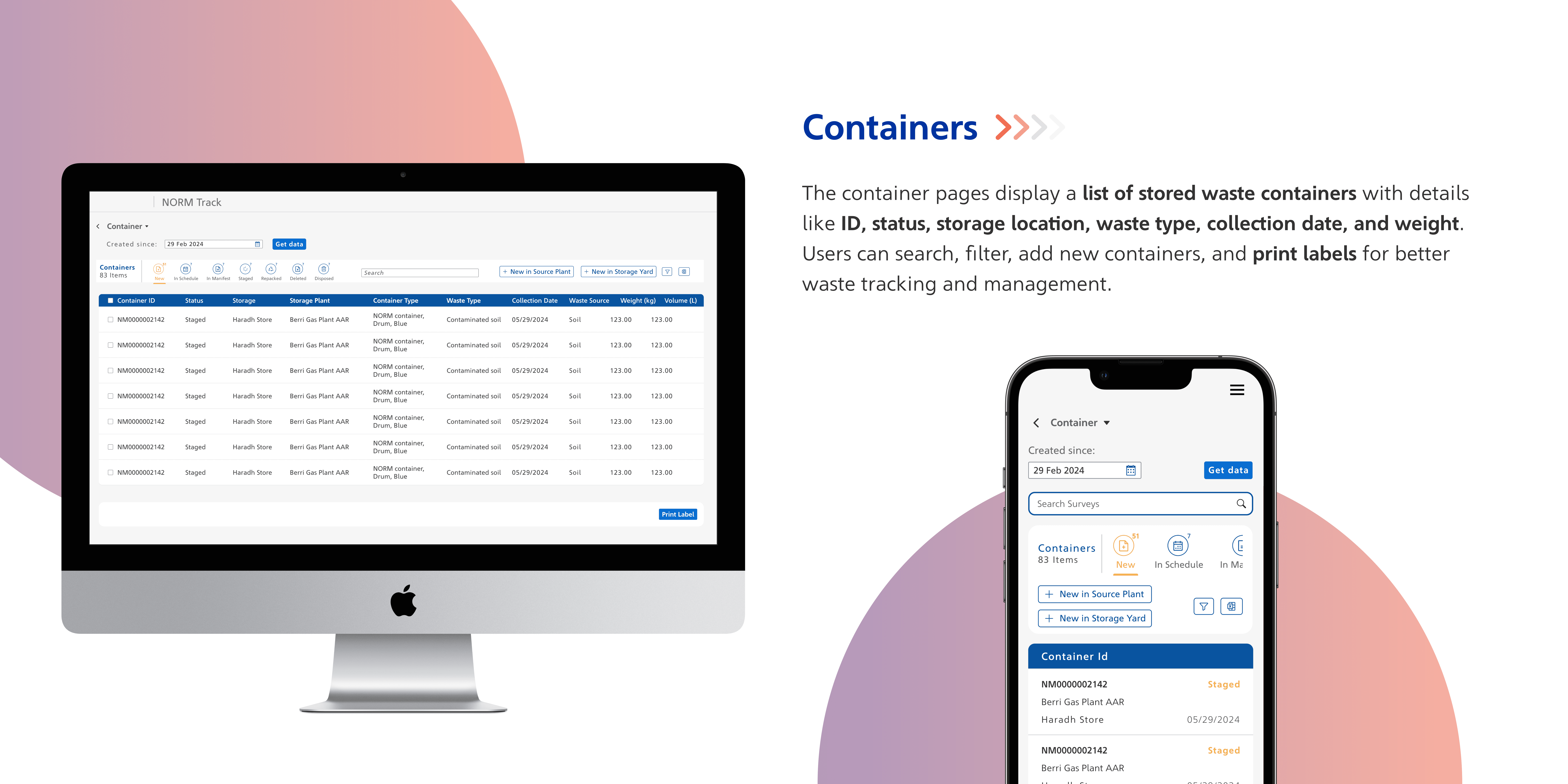
Modular dashboards with a clear focus on container status, radiation levels, and yard zones.
Introduced color-coded indicators and simplified icons to show safe vs. hazardous levels.
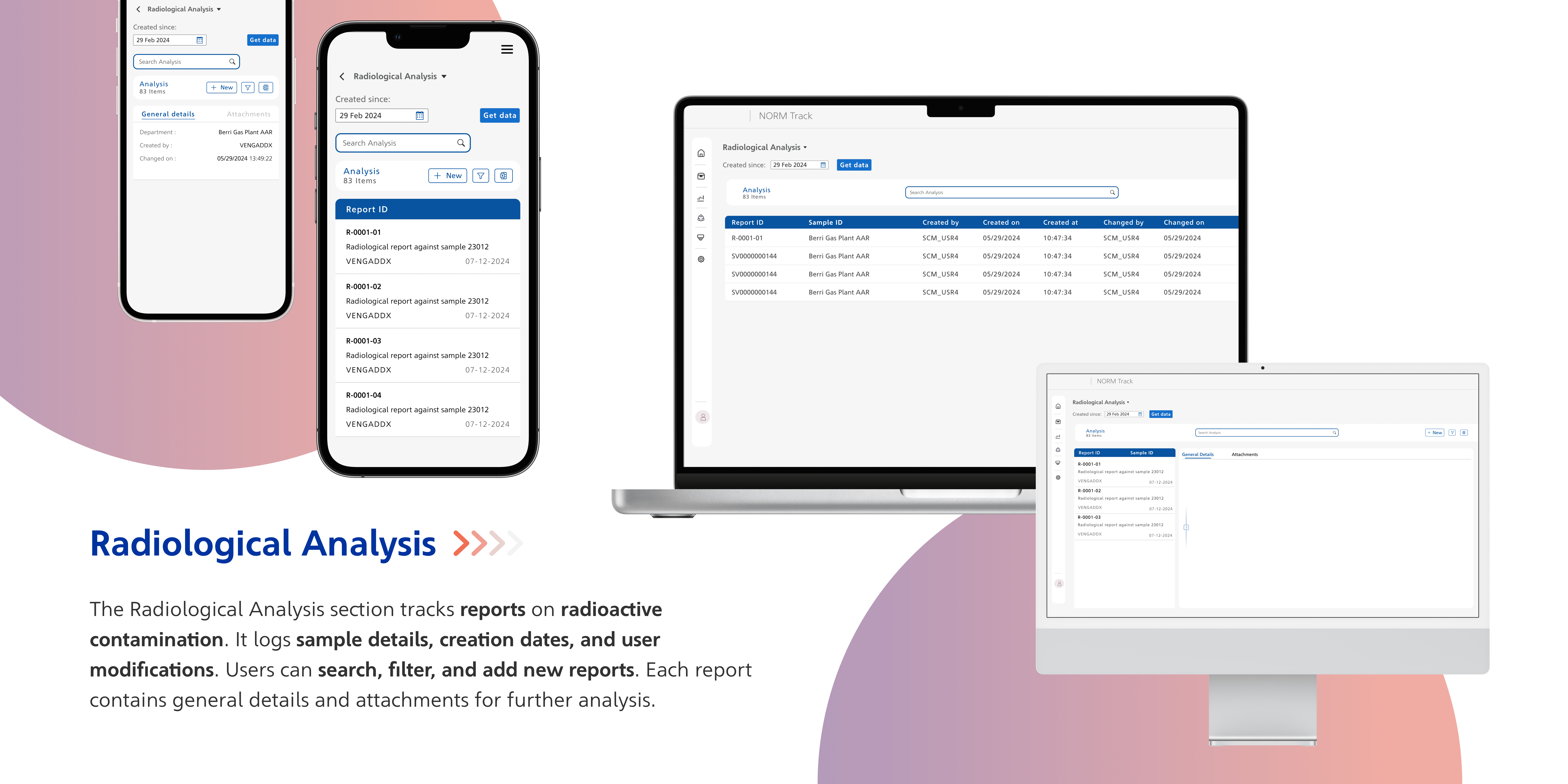
Designed a Radiological Analysis section to present data visually using graphs and status chips.
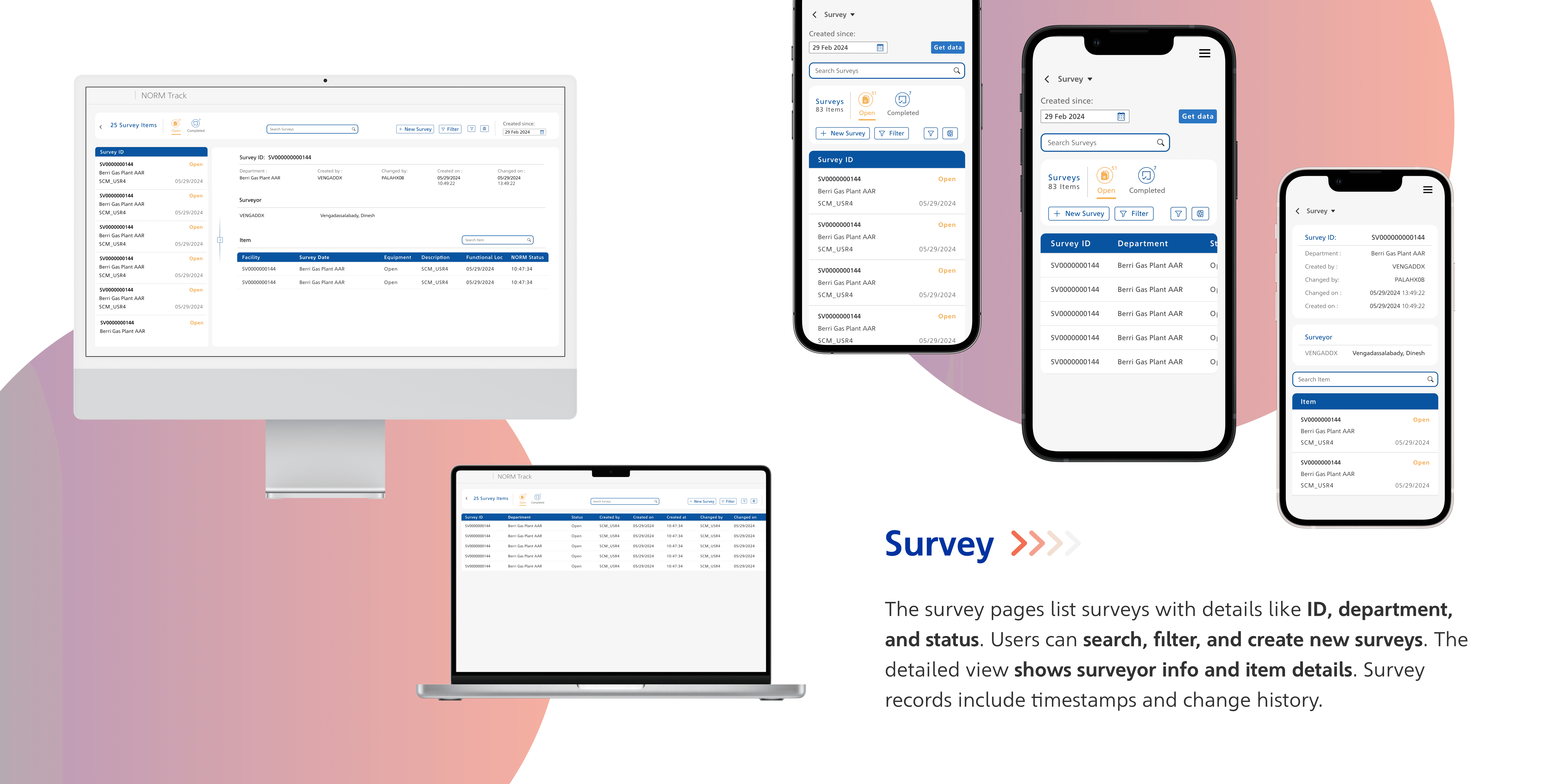
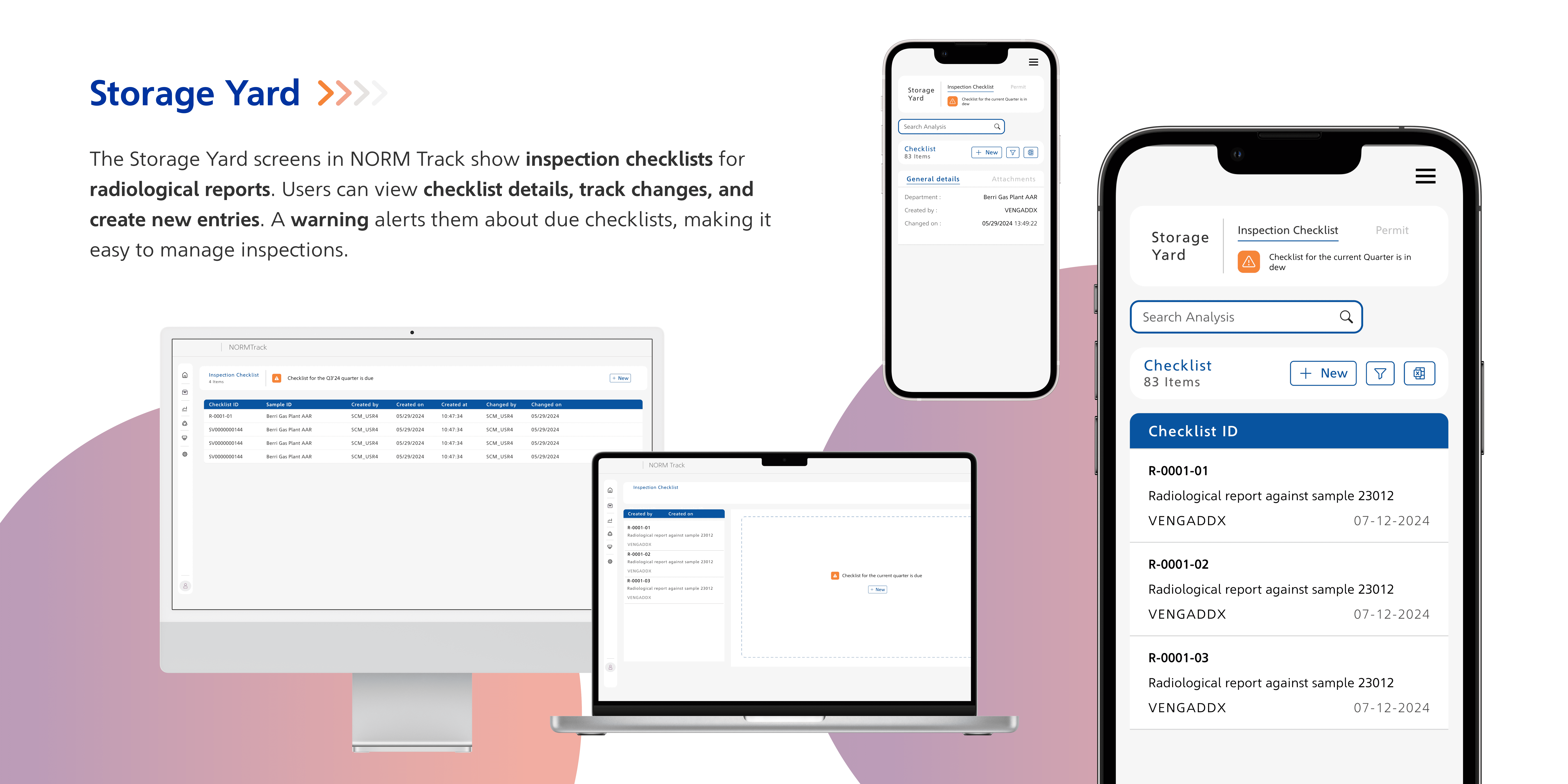
Created mobile-friendly views to support field usage with large tap areas and collapsible filters.
Ensured all designs followed client typography, grid, and color systems using their provided design system.
Key Screens:
Results / Reflections
The new design received positive feedback from internal stakeholders for being clean, navigable, and informative.
I learned how to balance technical data with usability and the importance of designing with safety and compliance in mind.
If the platform goes live, it’s expected to reduce inspection time by 30% and improve safety response across teams.