My Role
Junior UI/UX Designer – responsible for design interpretation, layout creation, and UI component development using provided presentation data
Project Summary
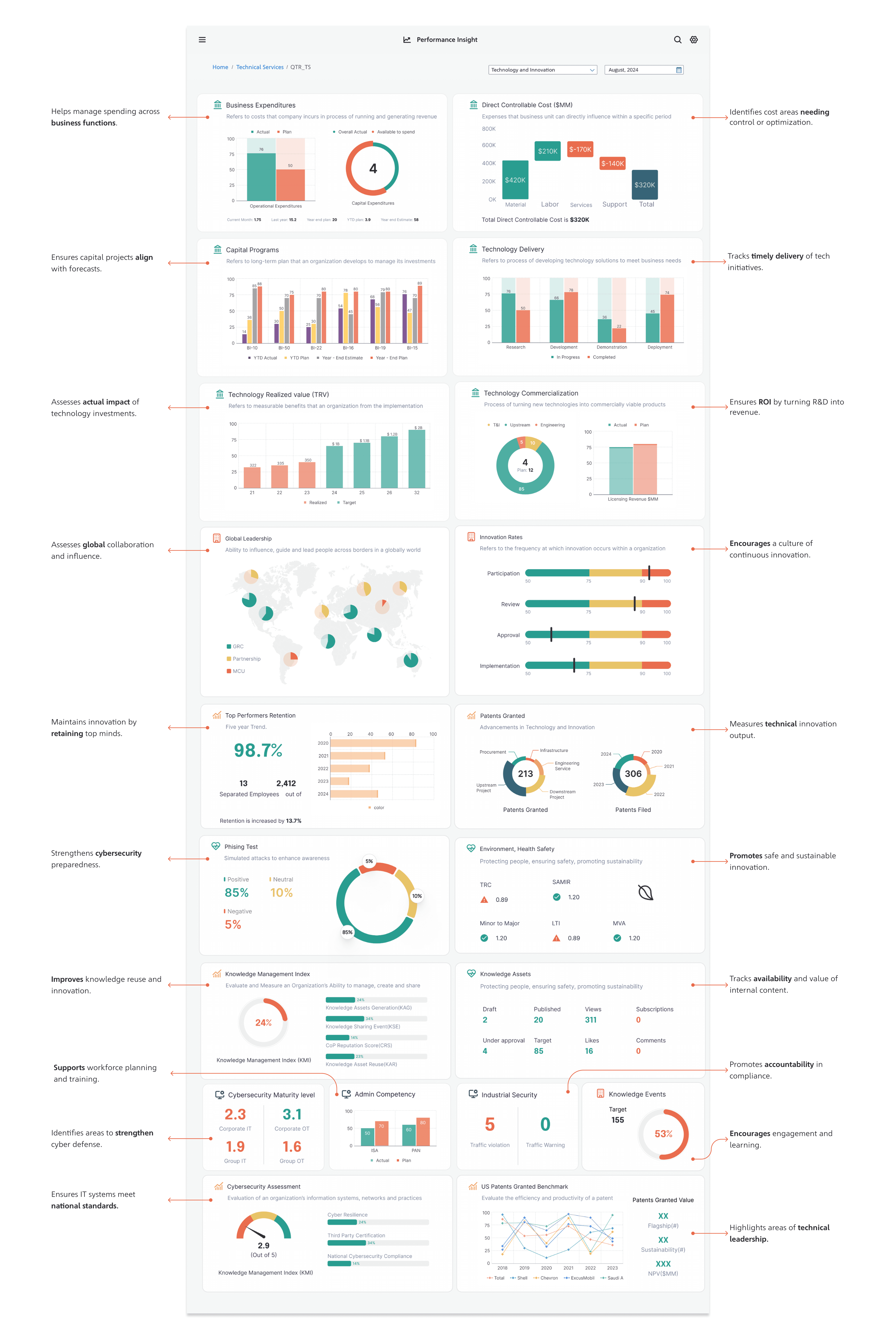
This project focused on designing a performance tracking dashboard that provides visual insight into different corporate sectors. The goal was to present KPIs and strategic updates clearly for executive stakeholders. I used a reference PowerPoint deck from the client that detailed required content and structure, and transformed it into an interactive UI format that aligns with modern usability standards.
The Challenge
Client reports were static, dense, and hard to scan:
Content was spread across multiple slides, making comparisons difficult
Key metrics lacked visual hierarchy and were buried in paragraphs
No responsive or interactive experience — everything was manual and linear
How I Approached the Problem
Reviewed the client’s PowerPoint content and structure
Identified repeatable UI patterns that could be used across departments
Used design judgment to organize data into modular dashboard layouts
Ensured consistency with corporate guidelines for colors, fonts, and logos
Solution & Design Strategy
I transformed static content into a clear, responsive dashboard UI:
Created section-based dashboard screens for each division (e.g., Technology & Innovation, Corporate Affairs)
Used modular card layouts to break down complex KPI content
Prioritized readability and data visualization, integrating charts and segment blocks
Maintained alignment with client-provided brand and accessibility guidelines
Key Screens:
✅ Corporate Application Development – KPI overview

✅ Corporate Affairs – Strategic Objectives Dashboard

✅ Technology & Innovation – Metrics Snapshot

Results
Delivered a clean and scalable dashboard design ready for implementation
Enhanced visibility of KPIs for leadership teams
Project helped shift from static reporting to a dynamic performance insight tool